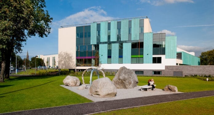
The site for the new Renal Unit at Edinburgh Western General Hospital is located on the main access road into the hospital complex and sits between the Scottish Health Service Centre (SHSC) training and administration building to the east, and Ward 1 to the west. The new building replaces the existing renal unit which was 30 years old.
The site for the new Renal Unit at Edinburgh Western General Hospital is located on the main access road into the hospital complex and sits between the Scottish Health Service Centre (SHSC) training and administration building to the east, and Ward 1 to the west. The new building replaces the existing renal unit which was 30 years old.
The site itself presented a number of challenges:
- The site drops approximately 2.5m across its width, and slopes down from north to south.
- The main access road into the hospital (on the north) is busy, and whilst there is no space for patient drop off, the brief required an entrance for visitors arriving on foot, with the main entrance to be located to the south, to accommodate patients and visitors arriving by car.
- The site is located adjacent to the old Nuffield Transplantation Surgery Unit (now Ward 1) dating from 1963 and designed by Peter Womersley, an important (but often overlooked) British architect of the 20th Century. The brief required the new Renal building to physically connect to this building (and its internal circulation), facilitating access to the wider hospital.
- Existing access to the adjacent Scottish Health Service Centre (SHSC) building had to be maintained to the east of the site.
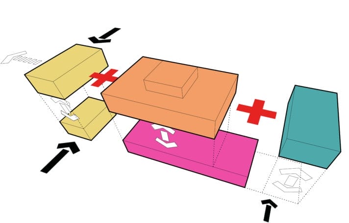
The new building responds to these challenges in a number of different ways. The new building is dug into the sloping site and exploits the topography by placing the treatment areas on the upper level, along with public waiting area and supporting staff and admin areas, to exploit the views south and availability of natural light. The link across to Ward 1 is also on the upper level, adjacent to the entrance area. The supporting utilitarian uses such as staff changing, storage and plant areas are located on the lower level, dug into the slope.

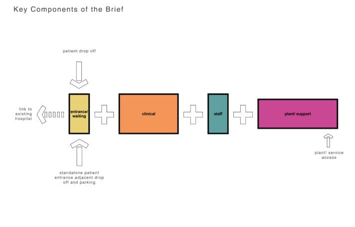
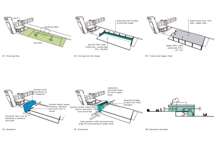
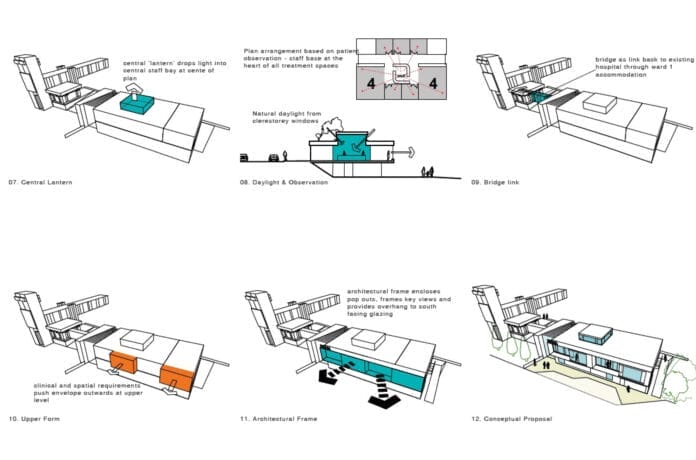
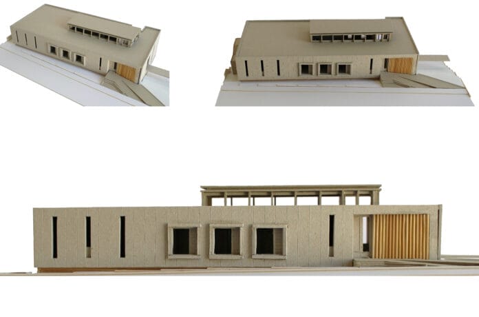
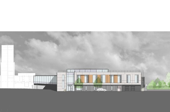
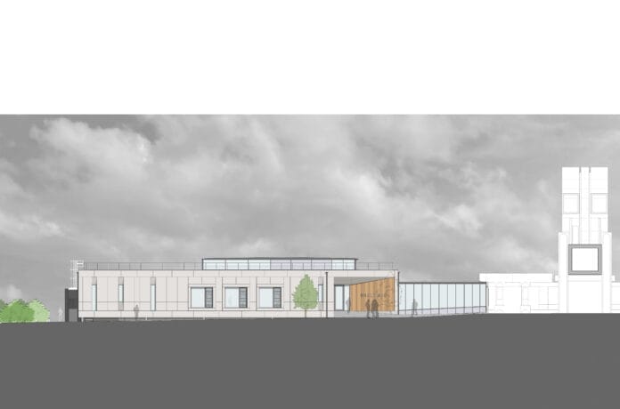

The design of the building prioritises the patient experience, as patients can spend several hours a day in treatment. The upper level is arranged with the main treatment rooms located to the south, with views across the adjacent residential properties towards Edinburgh’s West End and Edinburgh Castle. The plan is arranged with the staff base located at the heart of these treatment areas, to maximise patient observation, with a clerestory rooflight directly above, bringing further natural light deep into the plan.
The main entrance from the south leads into a fully glazed double height space, where a staircase connects to the secondary (north) entrance and waiting area on the upper level. This 2 storey circulation space bookends the plan and provides the transition and connection between the new renal unit and the adjacent ward 1 building, allowing views through the double height space to aid natural wayfinding and orientation.
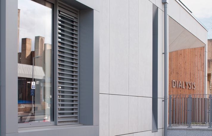
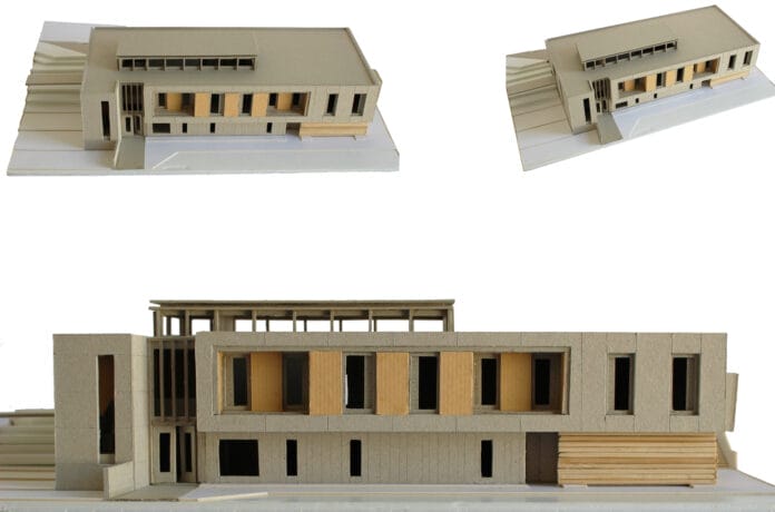
Externally, the language of the new building references the Womersley building, echoing the vertical slot window proportions of the bridge link and the large punched apertures of the circulation tower, whilst the exterior is clad in large panels, similar to those on the Womersley building.

Interiors
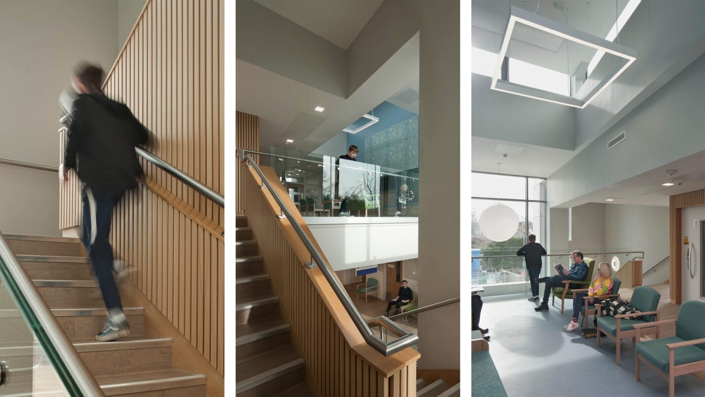
Interiors are kept simple and are designed to assist in orientation and wayfinding. The main circulation stair and lift core is clad in warm timber, leading patients and visitors up to the upper level waiting area, and through to the treatment bays. The public waiting area sits within a double height space with views south to Edinburgh, and a clerestory rooflight above to draw in natural light. The treatment areas also adopt a similar approach, with a neutral background and natural light from the clerestory rooflight, punctuated by areas of warm timber and a soft blue highlight.
Landscape
The landscape design creates a welcoming approach to both entrances of the building. To the lower level, linear paving provides direction and defines the entrance, in grey and neutral colours to compliment the building palette. A combination of robust steel and FSC hardwood timber were used for street furniture to provide contrast to the paving. The upper level features both stepped and graded footpath access, and framed with small multi-stem tree planting, to provide a vertical softer greening structure. Soft and colourful seasonal planting has been incorporated to further enhance each approach.

