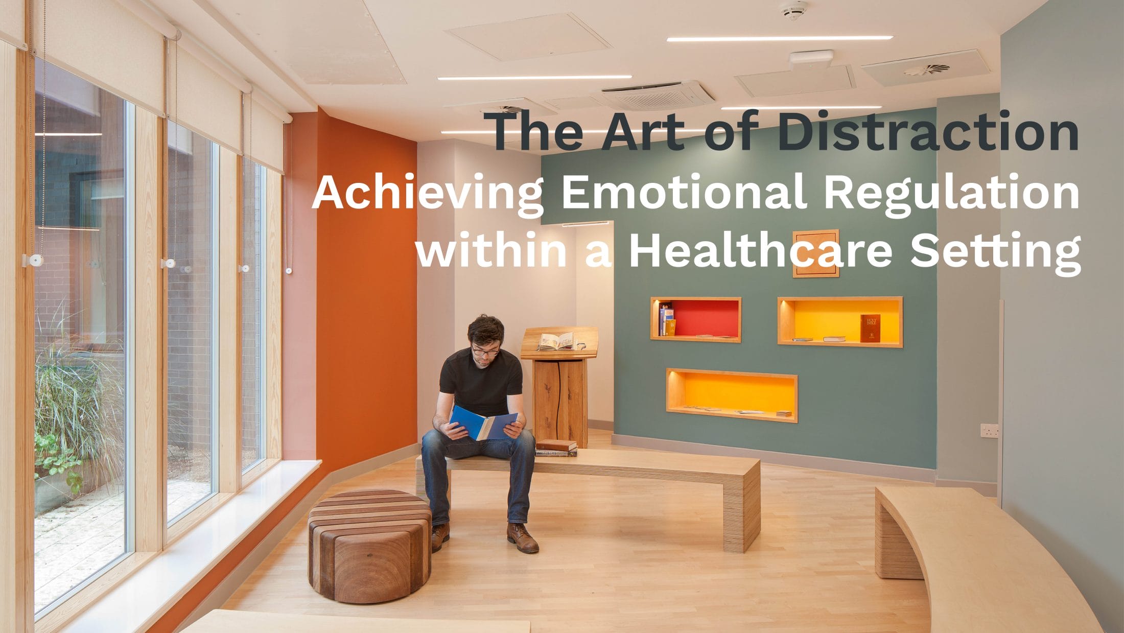
Ever since cavemen first used their hands to make prints on walls, humans have sought to enhance their environments to suit their needs and reflect their personalities. In architecture, freedom of expression is typically limited to private dwellings but inclusive design is becoming ever more prominent for public buildings.
Thoughtful use of art, colour and light can have a positive impact on users’ wellbeing and experience, and the healthcare environment is one that can be notably enhanced by this approach.
Healthcare architecture has historically been associated with institutionalised establishments, with many medical waiting rooms painted the unpleasant shade of watered-down pea soup. Yet there is plentiful evidence that colour can have a beneficial psychological effect.
On the recently completed Edinburgh Royal Hospital for Children and Young People (RHCYP) project, which also houses the Department of Clinical Neurosciences (DCN) and the Child and Adolescent Mental Health Services (CAMHS), the sensitive nature of the facilities coupled with the local demographic led our design team to develop a comprehensive arts and wayfinding strategy to aid user satisfaction.
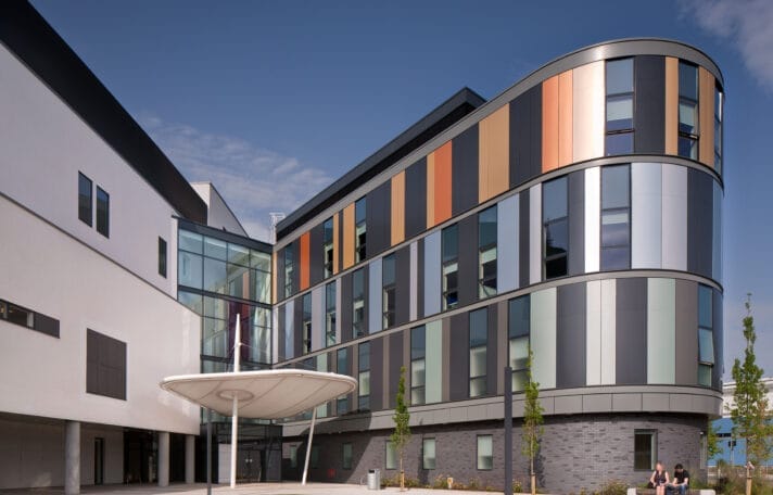
The complex development, which brings together both out- and inpatient facilities for paediatric care, specialist neonatal care, neurosciences and adult and children emergency departments, covers over 51,000 square metres. The team recognised the importance of not only providing an overall identity for the build, but also individual departmental differences to clearly direct users throughout the building.
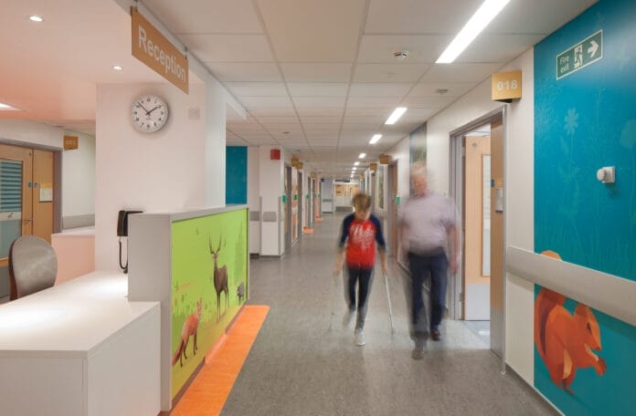

This was implemented through a concept based around the city of Edinburgh and its wider natural surroundings.
Each level of the hospital followed its own theme, progressing from ‘urban’ on the ground floor, up through ‘rural’, ‘lochs’, ‘mountains’, and finishing at the top level, ‘sky’. Colour palettes were chosen based on their association with the geographical context of the floor scheme, and were used through the wayfinding, interior design, architecture and landscape design, unifying the building and tying the different elements together. Bolder and brighter colours were applied to the child-focused areas, with more subtle hues in adult-focused areas.
To complement the geographical theme, art depicting relevant animals for each geography was selected. Created in a graphical style with appeal for all ages, the locations of these were carefully planned to stimulate interest along a route as a wayfinding trail, or at a destination point, such as a waiting area or treatment room. The joyfulness of the art strategy filters through into the furnishing and fittings, with seating that resembles animals frolicking and spyholes built into furniture depicting more animal kingdom imagery. Well considered art, colour and light all drive changes in perception, especially where human responses can be negative. Children can be calmed or engaged by interactive activities; worried parents can be reassured; busy or tired staff are less likely to feel stressed if they can take a break in a bright, vibrant and stimulating environment.
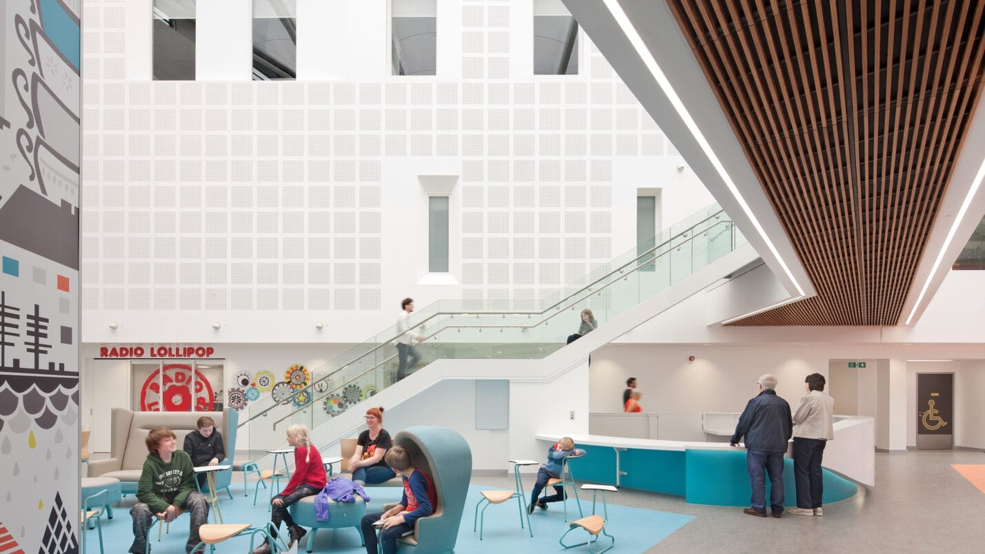
The amount of daylight is also a factor in how human behaviour toggles between calmness and stimulation.
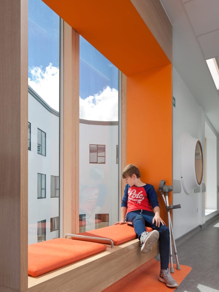
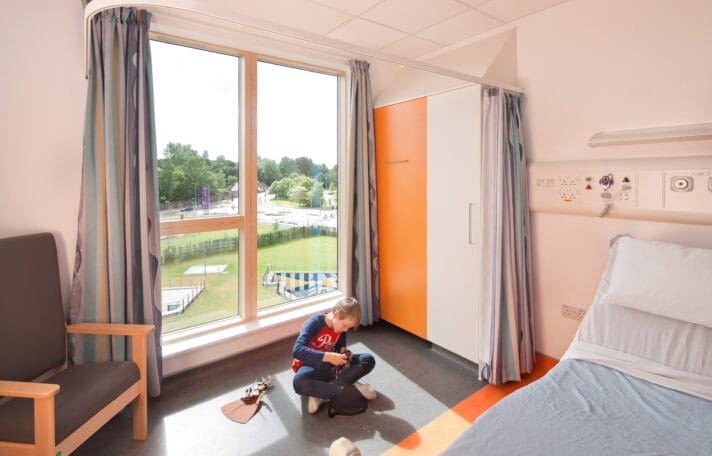
Open, airy and light spaces were created at RHCYP in common areas that are complemented by strategically placed art and interactive pieces, whereas patient rooms, which feature large windows, can be adapted according to patients’ preferred level of daylight. Additionally, along the length of the main hospital corridors, windows with views of the internal courtyard gardens have framed window seats to offer more intimate spaces for quiet reflection or rest. This spatial intimacy is mirrored in the atrium furniture, with child-sized, pod-like chairs for those who want to feel more sheltered and comforted in a large space.
Daily life fluctuates between rest and activity, and healthcare environments need to delicately balance this with different spaces catering to the wide neuro diversity of individuals. This design approach can provide spaces which recognise personal preferences, allowing people to get the most out of their experience and seek out spaces that support their own wellbeing. In accomplishing this, a variety of physical and emotional needs are met, which, after all, is healthcare’s primary focus.
Ensuring that the use of art and colour is implemented into schemes is integral to the design process if we want to capture opportunities to create better healing and therapeutic spaces
Often, an arts strategy is seen as an extra, and is the victim of value engineering. With wellbeing high on the agenda as society deals with a post-Covid fall-out, it has never been more important for architecture to address and modulate the vast array of feelings common in healthcare settings.
Thankfully, we are seeing a shift away from the desire to produce buildings as cheaply as possible with functionality the minimum requirement, towards a holistic and considered approach with the user experience front and centre. It is part of our responsibility as architects to demonstrate the far-reaching benefits this can bring to patients, staff and visitors. Through inclusive designs, we can create healthcare buildings that are standout pieces of architecture, provide a nurturing and inviting environment, and have a positive lasting effect on those who use them.


